Your Design Reveals Your Assumptions About People

In 1960, social psychologist Douglas McGregor developed Theory X & Theory Y—an idea that revolutionized the way we think about management.
The idea is that a manager’s beliefs about how people are motivated affect how they manage.
Theory X managers assume the following:
“1. Work is inherently distasteful to most people, and they will attempt to avoid work whenever possible.
2. Most people are not ambitious, have little desire for responsibility, and prefer to be directed.
3. Most people have little aptitude for creativity in solving organizational problems.
4. Motivation occurs only at the physiological and security levels of Maslow’s Needs Hierarchy.
5. Most people are self-centered. As a result, they must be closely controlled and often coerced to achieve organizational objectives.
6. Most people resist change.
7. Most people are gullible and unintelligent.”
As a result of these beliefs, Theory X managers tend to micromanage.
Theory Y managers assume these:
“1. Work can be as natural as play if the conditions are favorable.
2. People will be self-directed and creative to meet their work and organizational objectives if they are committed to them.
3. People will be committed to their quality and productivity objectives if rewards are in place that address higher needs such as self-fulfillment.
4. The capacity for creativity spreads throughout organizations.
5. Most people can handle responsibility because creativity and ingenuity are common in the population.
6. Under these conditions, people will seek responsibility.”
As a result of these beliefs, Theory Y managers tend to equip their teams, distribute authority, and get out of the way.
In 1988, pioneer in UX design Don Norman shared ideas similar to Theory Y. From The Design of Everyday Things:
“Do not blame people when they fail to use your products properly.
Take people’s difficulties as signifiers of where the product can be.
Eliminate all error messages from electronic or computer systems. Instead, provide help and guidance.
Make it possible to correct problems directly from help and guidance messages.
Allow people to continue with their task: Don’t impede progress — help make it smooth and continuous. Never make people start over.
Assume that what people have done is partially correct, so if it is inappropriate, provide the guidance that allows them to correct the problem and be on their way.
Think positively, for yourself and for the people you interact with.”
He encouraged designers to adopt these assumptions as they design user experiences.
It’s amazing that both UX design and organizational design take a people positive view: the belief that people are intrinsically motivated, self-directed, and want to do the right thing.
As a culture, I think we intuit this. Companies preach assuming positive intent. It’s not controversial to suggest that we should create the conditions for people to self-direct, learn, and grow. “Of course people do the right thing if trusted.”
However, I’d argue that we don’t always see people positive practices in both org and product design.
Here are two examples.
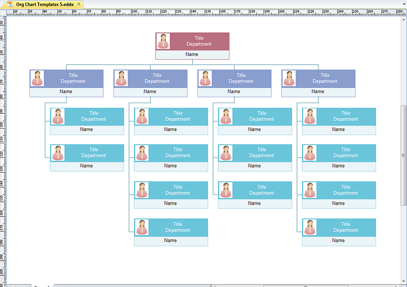
Org Charts: An Example in Organization Design

Operating Organization of the Union Pacific and Southern Pacific System, 1910
Org charts attempt to reflect the formal structure of an organization. Key word: attempt.
There are three problems with the org chart:
It hasn’t changed in a hundred years. Cars, phones, hardware, and software improved dramatically throughout the 1900s. Amidst these improvements in the past hundred years, the org chart stuck with its own ways. Today’s org charts still look like what they looked like in 1910.
Teams and roles change faster than the chart’s ability to make changes. Powerpoint can’t keep up with how quickly an organization’s structure updates itself. That’s why most org charts are outdated.
Org charts don’t reflect nonhierarchical relationships. If you’re an engineer at a >100 person company, the org chart likely shows that you report to a tech lead. However, you constantly work with designers and product managers. Your org chart doesn’t capture the fact that you work with others outside your discipline.
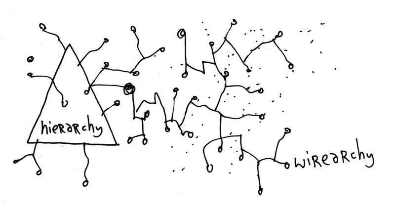
Imagine a manager saying “use your best judgement” and “do the right” and seeing this. Not very people positive.
An alternative to an org chart might be an ever-changing visual that keeps up with the emergent changes of an organization’s structure. I’ve yet to see a tool that does this well, but ideas like Sociocracy, wirearchy, and Niels Pflaeging’s value-creation structure offer great ways to think about structure in a less traditional and more emergent way.
There are more practices organizations do that feel very Theory X (bureaucratic policies, micromanagement, managers not getting evaluated by their directs), but let’s look at an example in UX design.
Error Summaries: An Example in UX Design
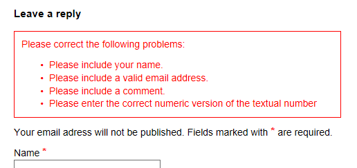
Again, two people positive guidelines Don shared:
“Eliminate all error messages from electronic or computer systems. Instead, provide help and guidance.”
“Allow people to continue with their task: Don’t impede progress — help make it smooth and continuous. Never make people start over.”
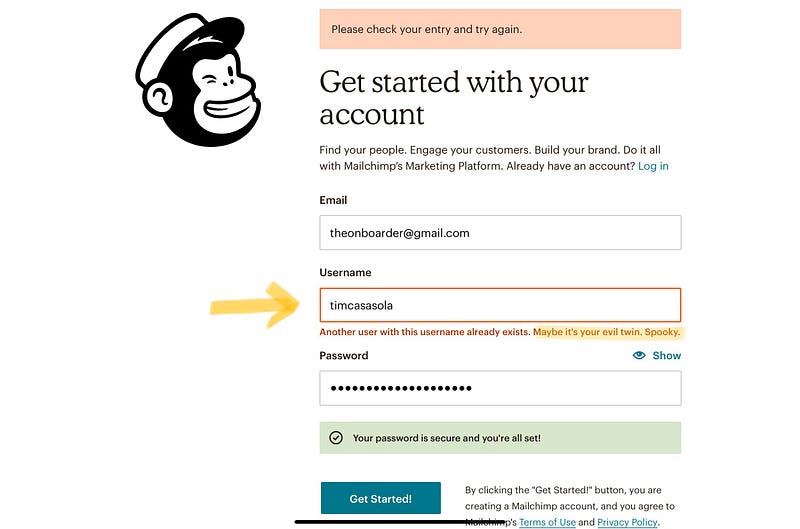
Despite these guidelines coming out in 1988 from a book revered by the UX design community, we still see error summaries in 2020. And we’ve all been frustrated by them. Who wants to start over when messing up at filling out a form?
Imagine being a design company that preaches “good design shouldn’t blame the user” and still designs error summaries. Your users will have a hard time trusting you when you say this.
Instead of creating an error summary, do this:
Share feedback immediately after the user inputs the data.
Specify what the user can do to change their input.
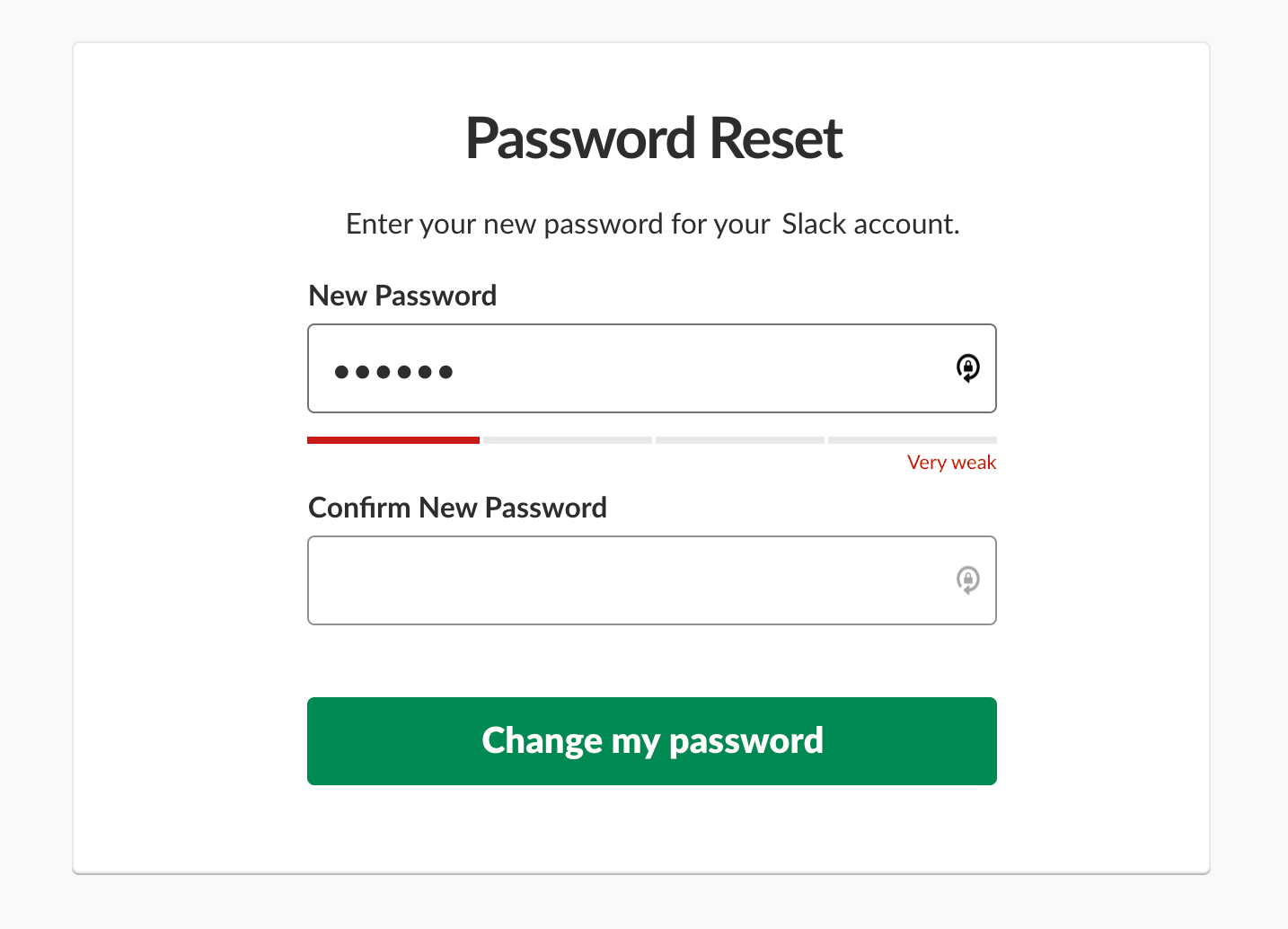 Slack gives instead feedback by showing a password-strength meter as the user types.
Bonus points if it’s fun, too.
Your UX writing can make it fun for users to “make mistakes!”
Showing is much more effective than telling
A big reason I chose to work at a company like Sanctuary Computer is that we practice the belief that people do the right thing when trusted. We share profit, take every last Friday of the month off, and work from home to prevent the spread of coronavirus in New York. No company is perfect, but we’re committed to improving where we can be better.
If you do adopt a people positive view, I encourage you to ask this: does your company’s products and ways of working reflect the belief that people do the right thing when trusted?. Look at the language and flows in your Figma files. Be aware of the way you communicate with a colleague who isn’t on your team. Observe how feedback is given and received. Notice if there’s a difference between what’s encouraged and what actually happens.
Don’t just say “people are doing the best they can with what they have” or “we empower people here.” Show it.
It’s much more impactful that way.
—
Credits to Aaron Dignan for coining “people positive” in Brave New Work.